Consumer behaviour is increasingly shifting towards the convenience of mobile applications for remittance, and companies need to keep up by providing a seamless and intuitive user experience. But are they measuring up?

Consumer behaviour is increasingly shifting towards the convenience of mobile applications, and companies need to keep up with the competition by providing a seamless and intuitive user experience.
In this new series of reports, we will compare and benchmark the mobile applications of a group of the leading remittance providers.
The goal is to compare different aspects of the app user experience; the signup process, the transfer process and features such as paying-in and paying-out capabilities, customer service features and costs.
The user experience provided by the applications of the leading providers in the space can help serve as a set of benchmarks for the wider sector.
In these reports, we will compare the six providers below.
These were chosen based on their market leading positions and ability to remit money to France, the destination of our money transfers, via the mobile applications.
- MoneyGram
- Ria
- Western Union
- Wise
- WorldRemit
- Xoom
Contents:
- Methodology
- The registration journey and making the first transfer
- How long does it take to register and make a transfer through remittance apps?
- Number of clicks
- What information is required to sign up and transfer money?
- Are users able to verify the fees and FX rates pre-signup?
- Conclusion
Looking for parts two and three?
Benchmarking Mobile Remittance Apps #2: Payment features, speed and costs
Benchmarking Mobile Remittance Apps #3: Customer service and other UX features
Methodology
To carry out this exercise, a member of our team registered and processed money transfers as a new customer with six remittance providers.
All benchmarking was carried out solely through mobile applications, hence company websites were not used as a comparison factor in any of the sections.
The data gathered is based on actual money transfers of £10 transferred from the UK to France (GBP to EUR) through the six providers listed above. All mobile applications were downloaded from the iOS App Store UK.
The main elements measured in this report are:
- Time to sign up and complete a transfer, measured in seconds.
- Number of clicks to sign up and complete a transfer (with a click specifically measuring moving from one screen to another).
- Sender information – the number of pieces of information required from users to sign up, complete.
- The KYC process of a transfer. This includes full name, email address, phone number, etc. The information recorded was based on a EU citizen transferring money from the UK to France (identification steps may vary depending on citizenship).
- Recipient information – the number of pieces of information required to identify the recipient.
- Ability to check FX rates and fees – whether the app allows users to verify these without having to create an account first.
Key takeaways

The registration journey and making the first transfer
The analysis is based on our experience of registering with remittance mobile apps and tracking the first transfer. This process is usually distinctive from the subsequent ones – providers typically ask for additional information to complete the KYC checks and register new recipients whose information can be saved for future transfers.
Thanks to new KYC and AML software providers (regtech), it is now possible to register and be approved instantly by remittance companies – a process that used to take companies several days to check new customers’ backgrounds and activate their accounts. In our study, all six providers activated the new accounts immediately.
In most cases (four of the six companies studied), there is no need to upload documents – providers use information such as the full name, address and date of birth to authenticate customers. This is known as e-KYC – a process that shifted from manual paper-based KYC checks to speedier electronic checks.
The customer onboarding and KYC process for remittance mobile apps takes place at different stages, and the type and amount of information needed varies across providers.
Some request KYC information during the initial signup, while other providers require it during the first money transfer process. Figure 1 below illustrates when the KYC process occurs for different groups.
Figure 1
Comparing the sign-up stage versus the money transfer stage
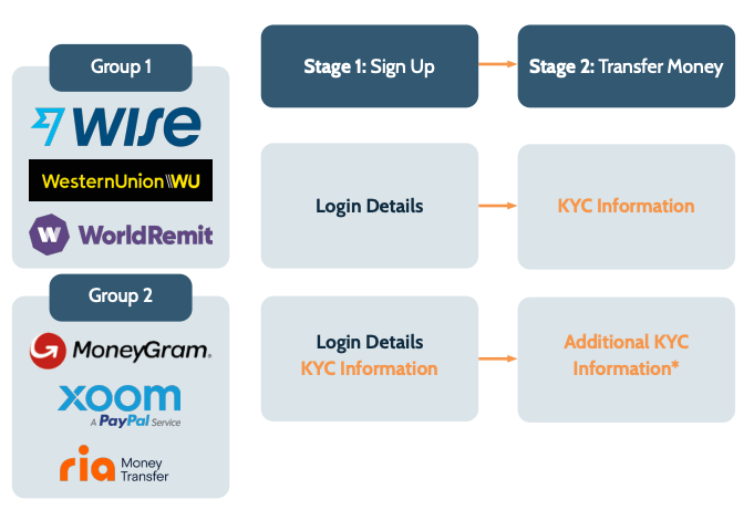
Can you create an account with a provider without going through KYC? The diagram illustrates the main difference between the two groups of companies above, namely when the KYC takes place.
The Group 1 providers – Wise, Western Union and WorldRemit – only request login details such as email address and country during the signup; the rest of the KYC information is required during the first money transfer. The Group 2 providers – MoneyGram, Ria and Xoom – require more detailed information during the signup process, as well as additional sender information during the money transfer.
Understanding these two stages is essential to analysing the overall efficiency of the user journeys. A provider such as Western Union might have a very short signup stage, but overall it may take longer to complete a transfer than with MoneyGram, which asks for more information at the signup stage but less details during the money transfer process.
In the subsequent sections, we look in more detail at what information is required to sign up, complete the KYC process and remit money, as well as the speed of the process from the point of download and signup through to the completion of a transfer.
How long does it take to register and make a transfer through remittance apps?
The time it takes to sign up and complete the first money transfer is dependent on the number of clicks and amount of information required to fill out. In order to have a fair and holistic comparison of the efficiency of the process, all three factors should be considered.
Figure 2 below presents the time it takes from the point of the app download, the signup and through to the conclusion of the transfer. Ultimately, the best user experience is one that is most efficient and presents the least friction.
Figure 2
Time to register and complete first transfer
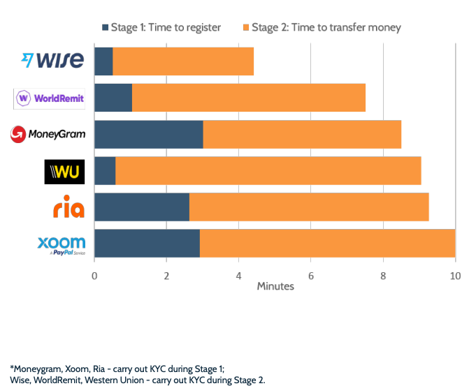
Wise is the quickest, both for signing up and completing a money transfer. Overall, it takes about 40% less time than the second quickest in the group, WorldRemit, and 56% less than Xoom, the slowest in this group. This is thanks to Wise’s clean and intuitive user experience and to the fact that it only collects the minimum amount of information necessary for a money transfer.
It is worth highlighting the differences and similarities between those providers that carry out the KYC checks during the signup stage and those that carry it out during the first transfer; Group 1 and Group 2 mentioned in the overview section above.
For both groups, the KYC is passed instantaneously unless there are further verification issues. Whether the provider requests an ID verification or only a few personal details, and whether this is carried out at the signup stage or during the transfer, users are instantly approved and can start processing a transfer right away.
One of the differences is that Group 1 – Wise, WorldRemit and Western Union – take significantly shorter time to sign up with, as shown in Figure 2.
One of the differences is that Group 1 – Wise, WorldRemit and Western Union – take significantly shorter time to sign up with, as shown in Figure 2.
This is expected given that these companies collect the KYC information later, during the process of the first money transfer.
Somewhat unexpected is that carrying out KYC checks during the ‘Stage 1: Signup’ doesn’t necessarily mean that the second part of the process will be shorter.
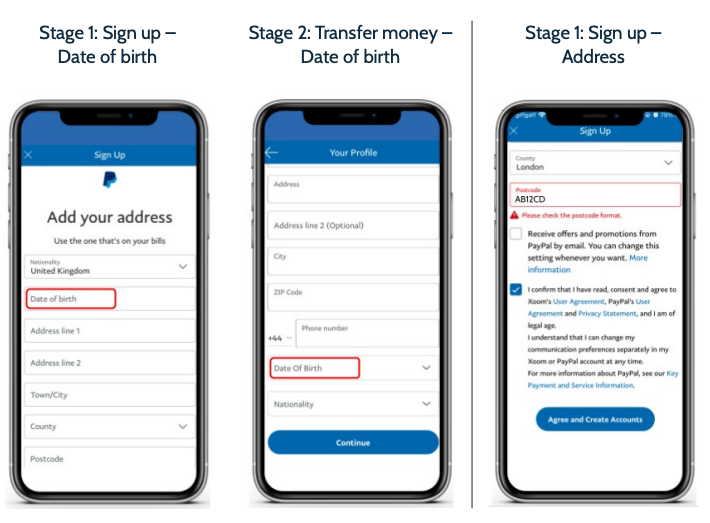
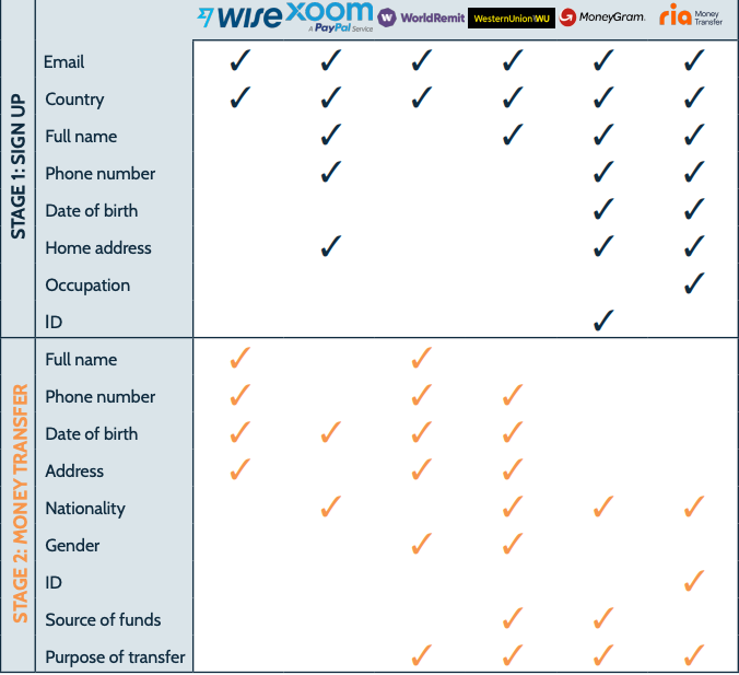
Both Xoom and Ria take a longer time to complete the ‘Stage 2: Transfer money’ than WorldRemit and Wise, even though KYC details have already been checked during the signup. Notably, Xoom asks for the date of birth of the user twice, at both of these stages (shown in Figure 3).
This, together with delays caused by such barriers as exact postcode formatting, are examples of elements providers could aim to eliminate to spare users of unnecessary delays.
Additionally, the amount of recipient information required also contributes to a lengthier process – this is covered later in this report.
Figure 3
Xoom app: Date of birth and postcode formatting
Number of clicks
The number of clicks is an indicator of how much effort is required from users to sign up with a remittance app and execute a money transfer. This, together with the amount of information needed throughout the process, directly impacts the overall time it takes to go through the user journey, presented in the section above.
Wise is once again at the top of the list – it takes only 11 clicks to sign up and remit money, compared to Ria’s 21 clicks. Western Union takes only one additional click – though it takes significantly longer than Wise. This is mainly due to the fact that users need to fill out more information throughout the process (Figure 5 and Table 1).
Ria is one of the providers requiring the most amount of information, which also translates into the largest number of clicks. Together with MoneyGram, these are the only two providers in our sample prompting users to scan an identification document – one of the contributing factors to a larger number of clicks than its peers.
Xoom takes a total of 17 clicks to complete the process – somewhere in the middle when compared to its peers. However, it is the slowest provider in terms of minutes to complete the signup and transfer money, mainly due to small details such as formatting and double entry of the date of birth.
Figure 4
Number of clicks: signing up and completing a transfer
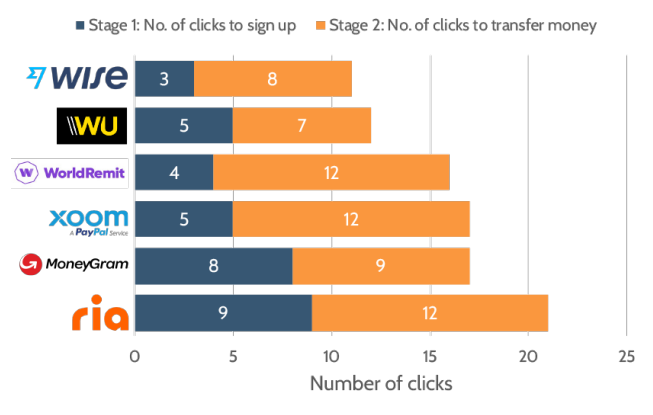
There are significant differences in the overall efficiency of the six applications. Generally, the lesser information the user has to input and the lesser clicks required, the better their ultimate journey – this is what makes the Wise app so user-friendly. Additionally, features that speed up or simplify the process, such as address lookups and scanning features, also improve the overall experience.
What information is required to sign up and transfer money?
The amount of information users have to input directly influences how fast they can finish the process – the faster someone can finish signing up with a provider, the sooner they can begin making transfers.
The number of clicks alone doesn’t reflect all the input that is required from users – it may be the case that on one page users are asked to fill out ten fields and on another, just one. This is why we have tracked what information users need to input from the moment of the app downloads through to the completion of the transfer. This includes login details, KYC information, any additional details and recipient information.
The findings in this section are based on remitting money from the UK to France, for a EU citizen. The information required in the KYC process may vary depending on citizenship and corridors.
In Figure 5, we compare the amount of sender information, in terms of number of elements, needed to sign up with providers, pass the KYC and complete a money transfer. In the subsequent figure, we compare the number of recipient details across the six providers.
Figure 5
Amount of information required at the signup and money transfer stages
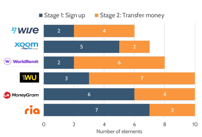
There are six essential sender details that are required as a minimum by all six providers (detailed in Table 1). This includes: email address, country, full name, phone number, date of birth and the home address. Wise is the only provider asking solely for this input, the rest request additional pieces of information.
Overall the most amount of information, and therefore the most amount of effort, is needed by MoneyGram, Ria and Western Union, with ten elements each.
That includes additional details such as the source of funds and the purpose of transfers. Ria and MoneyGram are also the only two providers to ask for identification documents to pass the KYC verification (note that this may be subject to the nationality of the sender).
Table 1
Detailed sender information
Recipient information
The type and amount of information needed to identify the recipient similarly varies across different providers. This is required in the ‘Stage 2: Money transfer’.
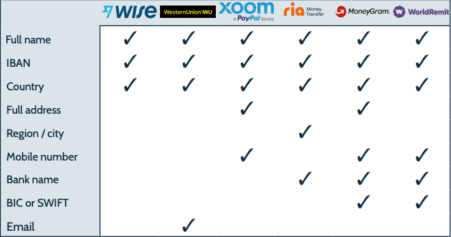
The recipient’s full name, IBAN and country are the three pieces of information required by all six providers unanimously. Western Union additionally requires an email address, Xoom asks for the recipient’s full address and mobile number, whereas Ria asks for the region and bank name of the recipient. This is detailed in Table 2.
Figure 6
Recipient information
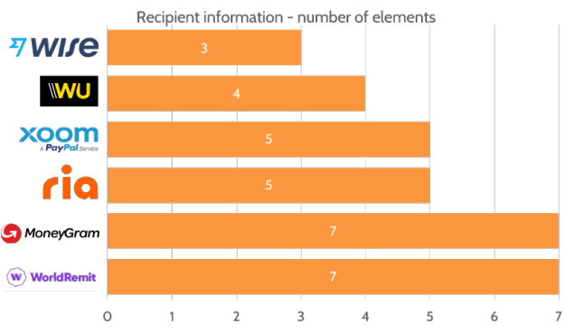
Wise has proven that it is possible to identify the recipient with three essential pieces of information. If this is sufficient, providers should carefully trade off the extra information they request versus the additional effort users will have to commit. For example, is it necessary to identify the full address of the recipient for an online transfer (as is the case for Xoom and Moneygram), or is it sufficient to indicate the city or region (Ria and WorldRemit), if at all?
Similarly, Western Union is the only provider to ask for a recipient email address. Yet, this email wasn’t used for any notifications or communications with regards to the transfers. It may be the case that it is used for other purposes such as marketing campaigns, or it may present another example of elements that could be eliminated to make the user journey more efficient.
Table 2
Detailed recipient information
Are users able to verify the fees and FX rates pre-signup?
As part of this benchmarking exercise, we have also investigated whether users are able to check the FX rates and fees they would incur before signing up with a new provider.
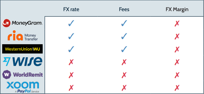
Out of the six providers examined in this exercise, only half – MoneyGram, Ria and Western Union – allow users to check the rates first without any prior requirements.
While all companies show the FX rate offered at some point before the transfer is made, none of them explicitly indicate the FX margin or the interbank rate at the time of transfer.
Table 3
Ability to check the FX rate and fees prior to signup
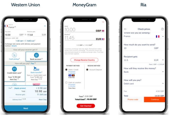
For the apps that do offer the ability to check the rates before signing up, these usually take into account how the sender wishes to pay for the transfer as well as how the recipient will receive it (i.e. bank account, cash) to display the accurate fees and rates.
The screenshots opposite show how this is implemented by MoneyGram, Ria and Western Union.
Figure 7
How rates are shown before consumers sign up
Conclusion
This analysis compares the user journeys on mobile applications of several leading remittance companies. It focuses specifically on the journey of signing up to remittance providers and making a transfer. The subsequent reports will compare costs, payment, customer service and other UX features.
An important factor in this exercise was the KYC journey. What used to take companies several days to identify and approve new users are now instant, thanks to new processes and KYC and AML software providers.
This is the case for all the providers studied – the difference, however, is when this process takes place. For half of the companies – MoneyGram, Xoom and Ria – the KYC stage takes place during the signup, for the other half – Wise, Western Union and WorldRemit – it is during the first money transfer. It is therefore essential to analyse both these stages together and compare the efficiency of the overall user journey.
The main takeaway is the efficiency of the mobile apps. Our findings show that Wise has the most streamlined and efficient mobile application out of the six providers in the group. It takes the least amount of time to sign up and complete the first transfer; it requires the least number of clicks and the least amount of sender and recipient information from the point of download to the point of completing a transfer.
In terms of the efficiency of the user journey, there are several factors that come into play; the number of clicks from the start to the end of the process, as well as the amount of information asked. In certain instances, formatting requirements can also cause delays to the overall journey.
Our findings have also highlighted the variance between providers. For example, with the fastest provider, Wise, it took under five minutes to sign up and process a transfer—this was more than double the time with the slowest app on the list, Xoom, over ten minutes. Similarly, the amount of information required throughout this process, such as name and address, varies from as little as six pieces of information for Wise to ten pieces of information required by MoneyGram and Ria.
